Understanding Color Psychology
Color plays a pivotal role in interior design, significantly influencing the atmosphere and emotional response within a space. The field of color psychology delves into how different hues can evoke various moods and feelings, making it essential to consider these aspects when selecting the best paint for your home. Understanding the psychological effects of color enables homeowners to create environments that align with their desired ambience.
For instance, warm colors like reds, oranges, and yellows are often associated with energy, warmth, and vibrancy. These shades can stimulate conversation and encourage social interaction, making them ideal for common areas such as living rooms and dining spaces. Conversely, cool colors such as blues, greens, and purples tend to evoke feelings of calmness and serenity. These hues are suitable for bedrooms and relaxation areas where tranquility is paramount.
Neutral colors, including whites, grays, and browns, provide a versatile backdrop that harmonizes well with other colors. They can convey a sense of sophistication and are often utilized in modern interior design. Additionally, the psychology of colors extends to their shades and tints; lighter variations can make a space feel more airy and spacious, while darker shades tend to create cozier atmospheres.
Ultimately, the choice of paint colors should reflect personal preferences and the specific functionalities of each room. Recognizing the psychological implications of color can assist homeowners in selecting shades that not only complement their interior design but also enhance the overall experience of living in the space. By being mindful of the feelings that different colors evoke, one can craft an atmosphere that resonates with individual taste and lifestyle.
Analyzing Your Space
Understanding the specific characteristics of your home is a crucial step in selecting the best paint colors for each room. Effective interior design begins with a thorough assessment of your space, focusing on aspects such as lighting, size, and existing furnishings. Every space has unique features that can significantly influence how color is perceived, making this analysis essential to achieving harmonious results.
Natural light is one of the foremost factors to evaluate. Observing the way sunlight enters each room at different times of the day can provide insight into potential color temperatures. For instance, south-facing rooms often receive ample sunlight, allowing for vibrant colors to shine, while north-facing rooms tend to have cooler, dimmer light, which might benefit from warmer tones. Utilizing a paint sample and testing it on your walls during various times of the day is an effective way to visualize how the color will appear in its natural setting.
In addition to lighting, the dimensions of the room play a key role. Smaller spaces generally benefit from lighter paint colors, which can create an illusion of openness, while larger areas can accommodate deeper shades that impart coziness. It is also important to consider the existing architectural details and furnishings. Elements such as moldings, fixtures, and furniture should complement the chosen paint colors to create a cohesive look. Selecting hues that harmonize with existing decor will enhance the overall aesthetic and functionality of the space, ensuring each room serves its intended purpose effectively.
Lastly, understanding the function of each room is imperative when choosing paint colors. Different activities may dictate the mood and atmosphere required. For example, tranquil blues and greens may suit bedrooms or study areas, while lively yellows or reds might invigorate kitchens and living rooms. Assessing these factors collectively will guide you toward the best paint options for your home, allowing you to create a beautifully designed environment tailored to your lifestyle.
Creating a Color Palette
Choosing the best paint colors for your home requires careful consideration, particularly in creating a cohesive color palette. A well-constructed palette can transform your interior design, evoking emotions and enhancing the visual appeal of your spaces. Understanding basic color theory is vital in this process. The color wheel is a fundamental tool that illustrates the relationships between primary, secondary, and tertiary colors. Primary colors—red, blue, and yellow—serve as the foundation for creating all other colors. Secondary colors, formed by mixing primary colors, include green, orange, and purple. Tertiary colors result from combining primary and secondary colors, leading to a wider gamut of hues.
When developing your color palette, it is essential to select colors that complement each other, achieving harmony throughout your home. This means considering the intensity and warmth of colors. Neutral paints such as whites, greys, and beiges can serve as a backdrop, allowing bolder paints to stand out. When utilizing bright paint colors, it is advisable to limit their use to accent walls or smaller sections to avoid overwhelming the space.
To create a balanced aesthetic, consider employing the 60-30-10 rule: allocate approximately 60% of the dominant color, 30% of a secondary color, and 10% for accents. This approach ensures that your color palette is visually appealing and helps maintain unity across different rooms. Additionally, take lighting into account, as natural and artificial light can drastically alter how paint colors appear. Testing paint samples in various lighting conditions is a prudent step that can help you finalize your color choices.
Ultimately, developing a harmonious color palette for your home is a crucial aspect of effective interior design. By understanding color relationships and employing strategic planning, you can create a visually cohesive environment that reflects your tastes and preferences.
Choosing Room-Specific Colors
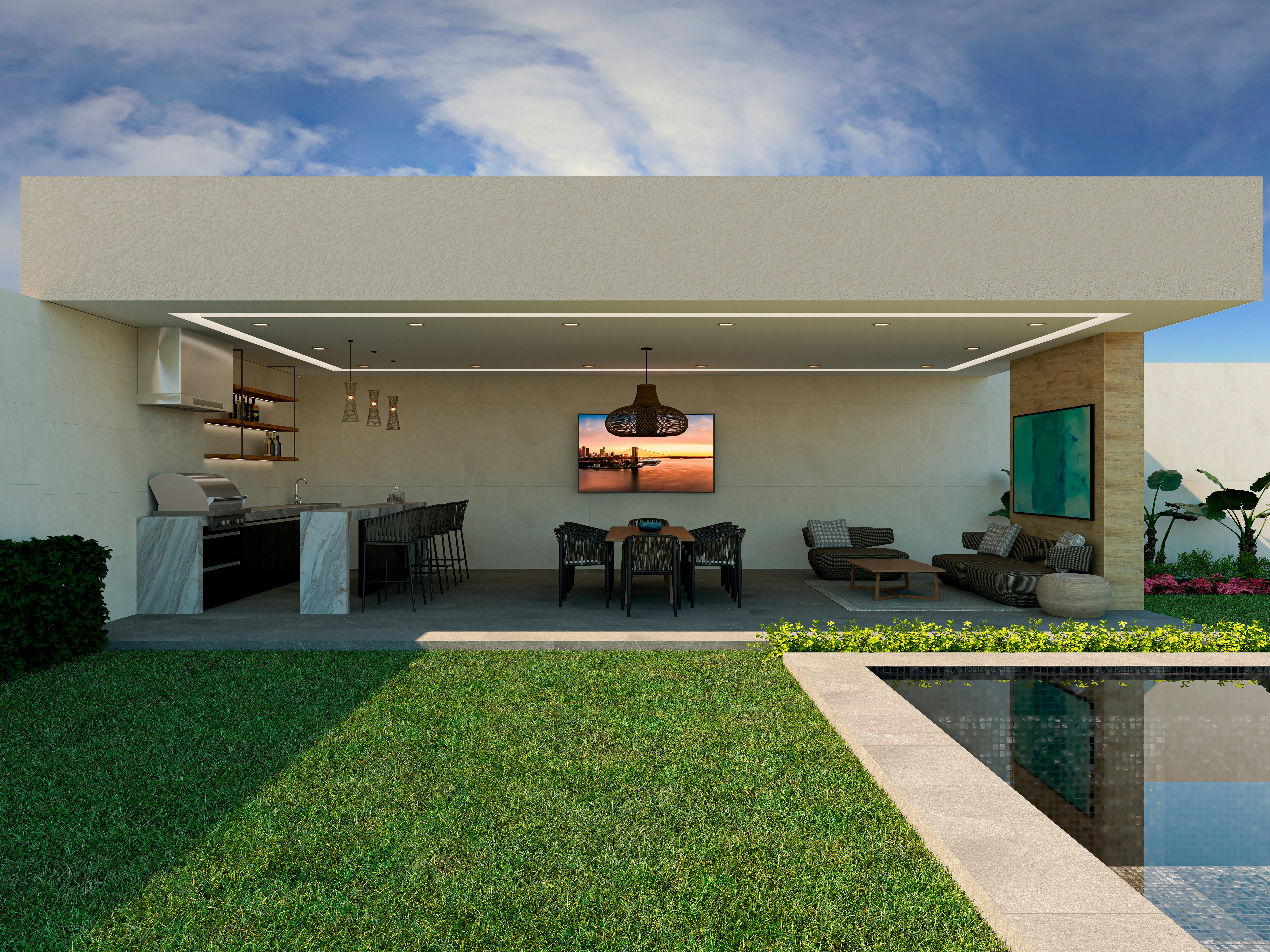
Selecting the best paint colors for different rooms in your home requires thoughtful consideration of each space’s purpose, desired ambiance, and functionality. In living areas, where family gatherings and social interactions occur, warm and inviting hues often work best. Shades like soft beige, light gray, or muted earth tones can create an atmosphere of comfort while still allowing for versatility in design. These colors also pair well with a variety of furniture styles, enhancing the overall aesthetic of your interior design.
For bedrooms, it is crucial to create a sanctuary that promotes relaxation and restfulness. Soft pastels, cool blues, and gentle greens are ideal for this purpose, as they can evoke a sense of tranquility. Additionally, darker tones, such as navy or charcoal, can add sophistication while maintaining a cozy feel. The intent is to select hues that cater to personal preferences yet remain conducive to restful environments, maximizing the comfort level of the space.
In kitchens, where functionality and brightness are key, opting for light and airy paint colours can increase the perceived room size and encourage a stimulating yet friendly atmosphere. Whites, light yellows, and soft greens are popular choices for this often busy area. These shades can enhance natural light and give an invigorating feeling, which is particularly important as kitchens serve as gathering spots for family and friends alike.
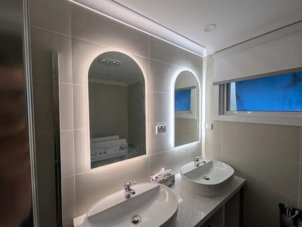
Finally, bathrooms should emphasize cleanliness and tranquility. Light blues, soft grays, and even pale lavenders can create a spa-like vibe, making daily routines more enjoyable. Additionally, darker paint colours can be utilized to achieve a dramatic effect, particularly with good lighting designed to balance the space. Overall, choosing the best paint colours tailored to each room’s function can significantly enhance the functionality and emotional impact of your home.
Testing Your Colors
Choosing the best paint colors for your home requires careful consideration and testing. Before committing to a particular hue, it is essential to see how it interacts with the specific lighting and furnishings within your space. One effective method to accomplish this is by using paint swatches. Paint swatches provide a quick way to visualize how colors will look in your home, allowing you to compare different shades easily.
When using swatches, it is advisable to select a few complementary colors and apply them to the walls in small sections or on poster boards. Position these swatches in various lighting conditions throughout the day. Natural light can significantly alter the appearance of a color, making it appear warmer or cooler, so observing your choices during morning, afternoon, and evening light will yield the best results.
Another recommended approach is to apply test patches directly onto the wall. This allows you to see how the colors interact with your furniture and decor. Choose a wall that receives a mix of direct and indirect light to fully evaluate how the paint will look throughout the day. Carefully consider the size of the patches; larger areas will give a more accurate representation of how the color will behave when fully applied.
During this testing phase, do not rush your decision. Take notes or photographs of how the colors appear in different situations. Additionally, observe how you feel in the environment as the light changes throughout the day, as the best paint colors should evoke a sense of comfort and enhance your interior design. By investing time in testing, you will ensure that your final choice aligns perfectly with your design vision and reflects the atmosphere you wish to create within your home.
Balancing Trends and Timelessness in Paint Choices
When embarking on the journey of selecting the best paint colors for your home, one must consider the balance between current trends and timeless shades. Trends in interior design can be enticing; however, they may change rapidly, leaving you with colors that feel outdated before you even enjoy them. Therefore, it is essential to approach color selection with a strategy that incorporates both contemporary inspiration and enduring elegance.
Timeless colors, such as soft whites, muted grays, and earthy tones, create a backdrop that complements various styles and follows evolving trends without feeling obsolete. These shades offer versatility and adaptability, allowing homeowners to frequently refresh their decor or features without needing to repaint entirely. In contrast, while bold colors or the latest trends can invigorate a room, they may also saturate the design landscape swiftly. By understanding the interplay of time and taste, you can identify paint colours that resonate with your personal style yet remain relevant over the years.
To maintain this balance, consider using trendy colors as accent pieces instead of dedicating entire rooms to them. For example, a popular deep blue or a vibrant green could serve as an accent wall or feature in smaller spaces rather than overwhelming the overall ambiance. This approach enables you to infuse modernity and express your individuality while maintaining a fundamentally timeless aesthetic in your interior design. Moreover, before making decisions, it is advisable to visualize how the chosen hues interact with natural light, furnishings, and other decor elements, ensuring a cohesive and sophisticated look in your home.
Ultimately, finding a harmonious combination of trending and timeless colors will assist you in making choices that reflect your taste and achieving an atmosphere that stands the test of time.
Incorporating Different Finishes
When selecting the best paint for your home, it’s essential to consider not just color, but also the finish that complements your interior design. Paint finishes can significantly influence the appearance and feel of the chosen color, and understanding their characteristics aids in making informed decisions for each room in your home.
Matte finishes are known for their non-reflective quality. They often provide a soft, sophisticated look, making them suitable for ceilings and low-traffic areas such as bedrooms. However, one of the drawbacks is that matte paint can be less durable, making it challenging to clean. This finish works well to enhance deeper and richer paint colours, creating a serene environment.
On the other hand, eggshell finishes offer a subtle sheen, resulting in a more elegant appearance while still being relatively easy to clean. This finish strikes a balance that allows it to be used in living rooms and dining areas, where durability and aesthetics matter. Eggshell is particularly effective in enhancing color depth without overwhelming the space.
Satin finishes, known for their glossy texture, reflect more light and are ideal for high-traffic areas such as hallways or kitchens. This type of finish enhances colors vibrantly, but it may reveal surface imperfections more than its matte or eggshell counterparts. For homes with children or pets, satin finishes offer practicality due to their ease of cleaning.
Lastly, gloss finishes provide maximum durability and shine, making them excellent choices for trim, moldings, and doors. While they bring a bold statement to the interior, high gloss can sometimes overpower softer paint colours when used excessively. It’s vital to balance these bold finishes with more subdued paint choices in the overall design scheme.
Carefully considering how each finish interacts with your selected hues will aid in achieving the desired ambiance throughout your home. Each space may require a different approach, allowing for a harmonious blend of color and texture in your interior design.
Utilizing Accent Walls
In interior design, accent walls serve as an effective strategy to introduce a distinctive element to a space. By selecting a bold or contrasting color for one wall, homeowners can create an eye-catching focal point that enriches the overall atmosphere of a room. To maximize the impact of an accent wall, effective planning and thoughtful color choice are essential.
When considering which wall to accent, it is beneficial to evaluate the existing layout and lighting of the space. A wall that is opposite a window often draws more attention, as natural light enhances the chosen paint color. Additionally, walls that frame architectural features, such as fireplaces or built-in shelves, can emphasize these elements when painted in a distinctive hue. It is crucial to select a wall that naturally draws the eye, ensuring that the accent wall harmonizes with the room’s design rather than detracting from it.
Choosing the best paint for an accent wall involves more than just selecting a vibrant color. The selected shade should complement the existing paint colours in the surrounding area while also evoking the desired mood. For example, deep, rich colors like navy or emerald can instill a sense of warmth and coziness, making them suitable for living rooms or bedrooms. Conversely, bright tones such as coral or teal can invigorate spaces like kitchens or home offices, inspiring creativity and energy. Additionally, considering the finish of the paint—whether matte, satin, or gloss—is vital, as different finishes reflect light in various ways, further influencing the aesthetics of the room.
Ultimately, the use of an accent wall can significantly elevate the interior design of any home, providing a striking visual contrast and a sense of unity within the space. By following the aforementioned tips, homeowners can confidently select the best paint colours to enhance their home, creating a stunning focal point that resonates with their personal style.
Finalizing Your Choices and Getting Started
After carefully considering the various paint colours and their impact on your home’s aesthetics, it’s time to finalize your choices and prepare for the painting process. Start by creating a checklist that outlines your selected colours, ensuring they complement each other and align with your interior design goals. If you have multiple spaces to paint, categorize each room and specify the corresponding colour, taking into account factors such as lighting and room size that can affect how the paint appears.
As you refine your choices, gather samples of the best paint options, applying swatches on your walls to see how they look in different lighting throughout the day. This step is crucial; colours can appear drastically different at various times and can influence the overall mood of your home. Once you’ve made your selections, you can confidently proceed to gather the necessary materials for your project.
Begin by creating a comprehensive list of supplies, which may include primer, brushes, rollers, paint trays, drop cloths, painter’s tape, and, of course, your chosen paint colours. Investing in quality tools will contribute to a smoother application process and a more professional-looking finish. Don’t forget to prepare your walls—cleaning them thoroughly and filling in any cracks or holes will ensure that the paint adheres well and that the final result is impeccable.
Finally, embrace your creativity! Painting is not just aboutwalls; it’s an opportunity to express your personal style and transform your living spaces. Take your time during the preparation phase; a well-planned approach will not only enhance the effectiveness of your painting project but will also lead to a more satisfying outcome.